Guide to Choosing Hues for Picture Frames and Mats
Mastering the Art of Choosing Colors for Picture Frames and Mats

Do you have you a framed piece of art or photograph, and feel that somehow it isn’t being shown to its best advantage? But you can’t figure out why. It could be the choice of colors used for the picture mat or the frame!
Selecting the right colors for picture mats and frames has a great impact on how your artwork looks and feels, and how well it complements your room.
Seems like a simple task, but color can be one of the hardest things to get right when having a picture framed.
At The Right Angle, our team are color experts. We help you choose the right frame to protect and display your piece, and make it shine in your space.
Understanding how colors work together is key. Let's explore some tips on choosing colors for mats and frames that enhance the beauty of your artwork.
Understanding Color Theory
Color theory involves understanding how colors interact and influence each other.
Colors can be primary colors (red, blue, yellow), secondary colors (green, orange, purple), and tertiary colors (mixes of primary and secondary colors).
Complementary colors (opposite on the color wheel) and analogous colors (next to each other on the color wheel) are essential terms you will need to know when selecting mat and frame colors.
KEEP THESE TERMS IN MIND WHEN READING AND REFER BACK TO THEM IF NEEDED!
Consider the Artwork's Palette
Begin by examining the colors present in your artwork. Are there dominant hues or accent colors that stand out? Choose mat and frame colors that complement or enhance these shades. Matching a color from the artwork can create balance, while choosing a complementary color can make the artwork pop.
Neutral Colors for Versatility
Neutral colors like white, off-white, black, or gray are versatile choices for mats and frames. They work well with most artworks, providing a clean and classic look. Neutral mats and frames allow the artwork to take center stage without overpowering it.
But as you probably know, there are a lot of whites, grays and off-whites to choose from. This is where our expert help really comes into play.
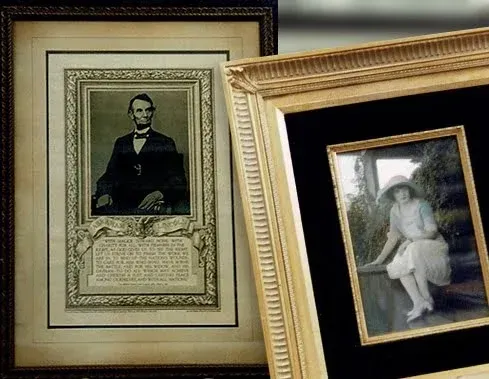
Using White Mats for Brightness
A white mat can add brightness and create a visual border around the artwork. It provides high contrast, making colors appear more vibrant and helping the artwork stand out. White mats work well with various art styles, from modern to traditional.
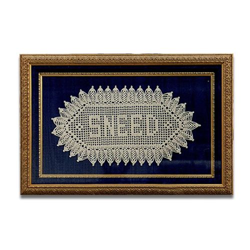
Black Mats for Drama and Contrast
Black mats can add drama and create a striking contrast, especially with colorful or vibrant artwork. They provide depth and can intensify the colors, drawing attention to the artwork's details.
Matching Mats to Highlight Specific Elements
Choose a mat color that highlights specific elements within the artwork. For instance, if your artwork has a dominant color, use a mat in a similar shade to draw attention to that particular hue.
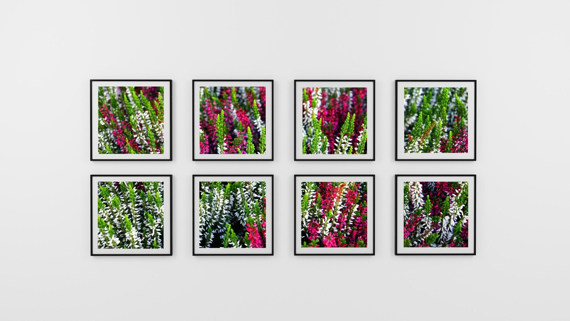
Experiment with Double Mats
Double matting involves using two mats of different colors to create depth and visual interest. Combine a wider neutral mat with a narrower accent color mat to add dimension and create a unique framing style.
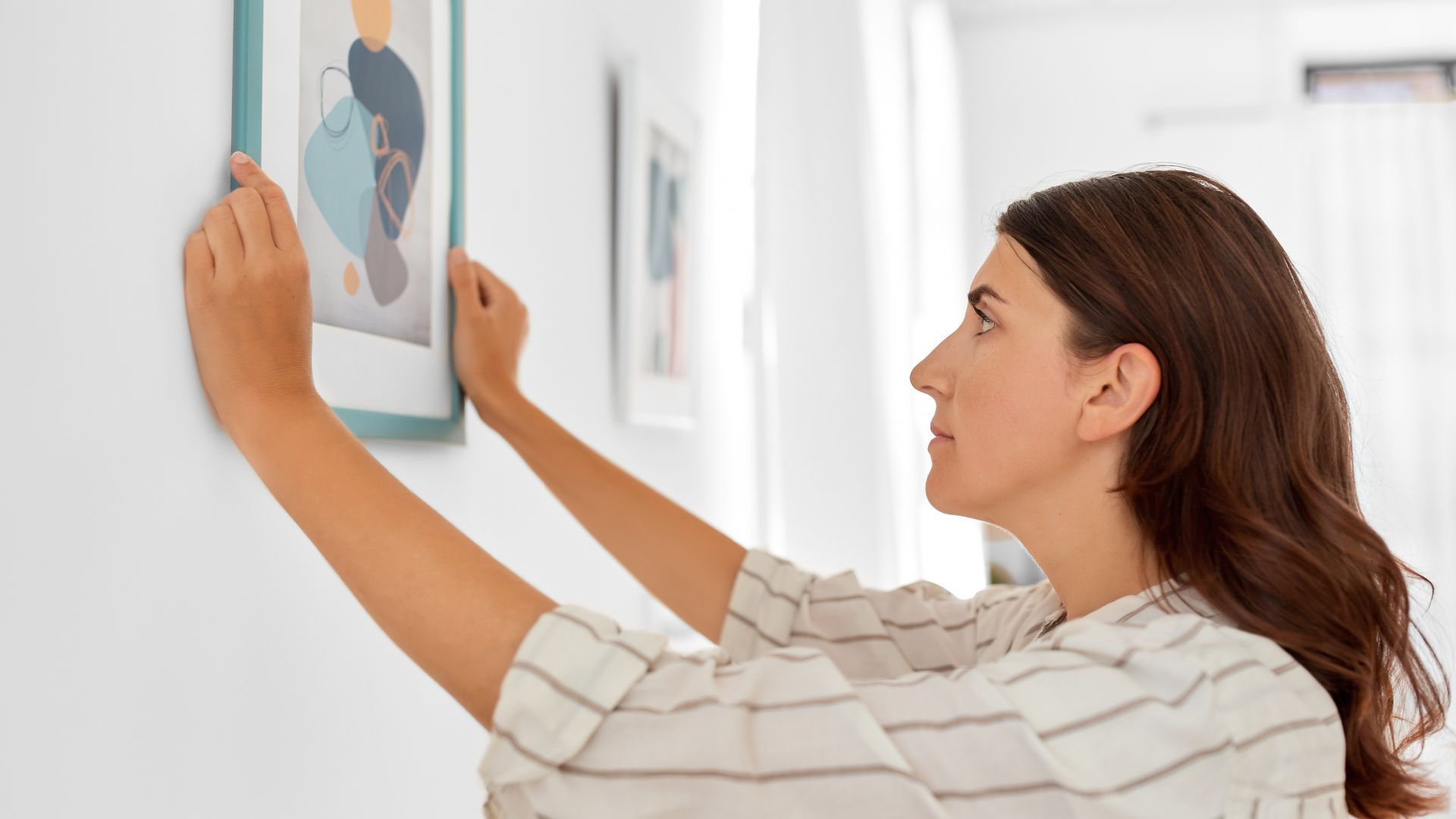
Harmonizing Frames with Artwork
Frames should complement the artwork without overpowering it. Consider the style and colors of the artwork when selecting frames. We will advise while keeping your tastes in mind.
Using Complementary Colors for Picture Frames
Choose a frame color that complements the dominant hues in the artwork. Complementary colors, like a warm-toned frame for cool-colored artwork or the other way around, can create balance and visual harmony.
Analogous Color Schemes for Unity
Choose frame colors that belong to the same color family as the dominant shades in the artwork. Analogous color schemes create unity between the frame and the artwork.
Contrast Frames for Emphasis
Contrasting frames, such as using a dark frame for light-colored artwork or a light frame for dark-colored artwork, can create emphasis and make the artwork stand out.
By using color theory, the artwork's palette, and experimenting with different combinations, we will help you create a beautiful complement to your artwork.
Don't hesitate to ask us for help, the experts at The Right Angle. We can advise you on the right framing solution for your cherished pieces.